Reference: pinterest.es/pin/58687601368686567/
The comment from the person who posted the picture is:
“I love traveling and the beautiful photography in this magazine spread just blew me away. The text is grouped together so that no other elements break that uniformity.”
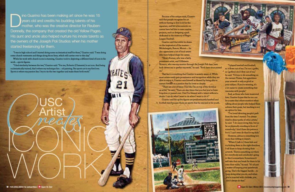
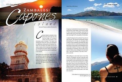
In the magazine layout, you find the sunset at the Capones Island located in San Antonio, Zambales province, Philipinnes. The islands are famous for their white sand and coral beaches, moreover, their rocky cliffs are a big attraction for the tourists. There is a famous lighthouse on the main island and you can see it at the bottom of the left page.
The Magazine layout catches your attention because of its contrast in the colors and in the typeface. The design has its time but you can sense the good taste in the pictures and in the font style.
TYPEFACE
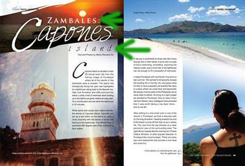
The oldstyle typeface used with small font on the top contrasts with the Script Style written in beneath the province to highlight the main attraction. The size, color, style and background help to send a clear invitation to the reader.
RULE OF THIRDS
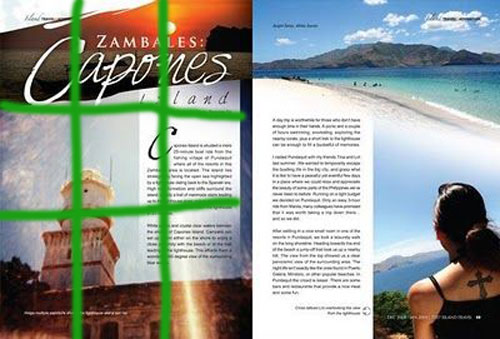
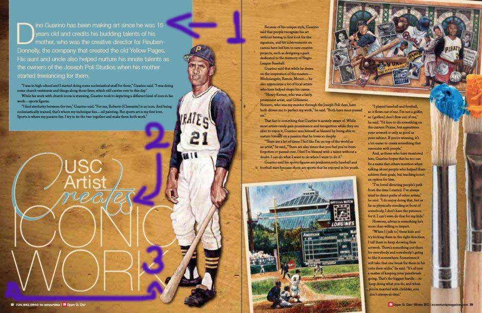
You can see on the left page that the lighthouse is on the corner of two lines. It remarks on its importance. That is the main attraction of the page.
LEADING LINE AND DEPTH FIELD
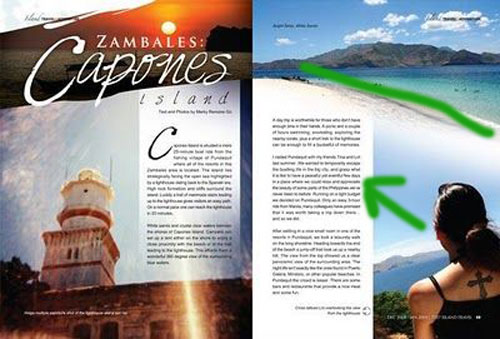
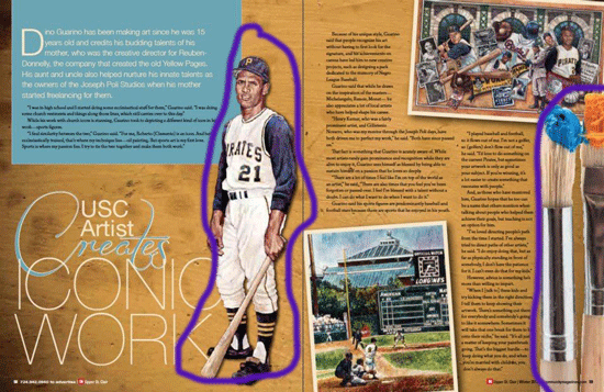
The shore makes a natural and strong leading line that fits with the sight focus of the woman in the picture. It brings a thoughtful attraction and helps to see one of its most beautiful features, the cliffs. The horizon in the background and the woman in the front provide a sense of the depth of field.
MIMIC PICS.
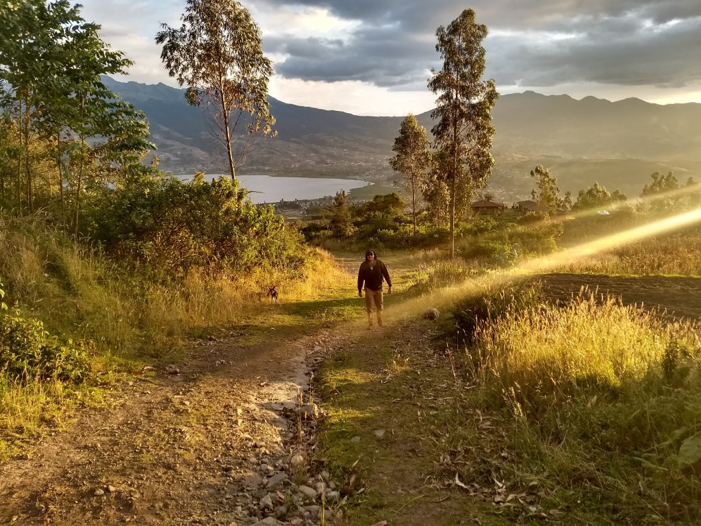
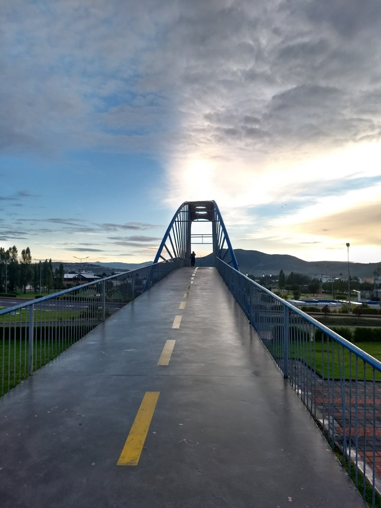
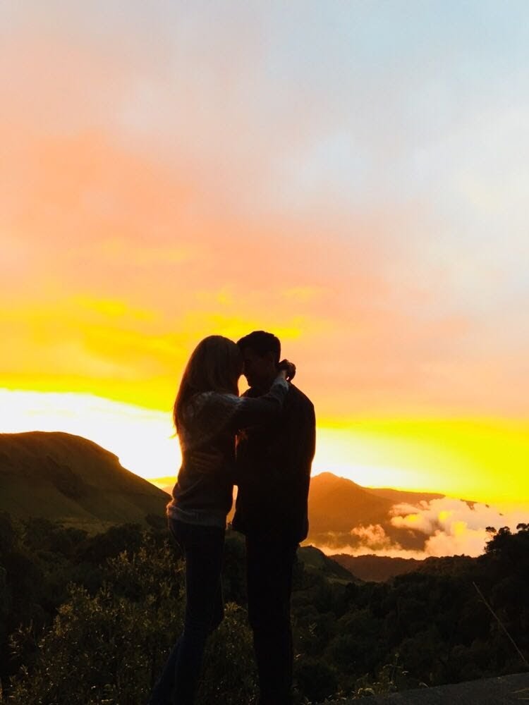
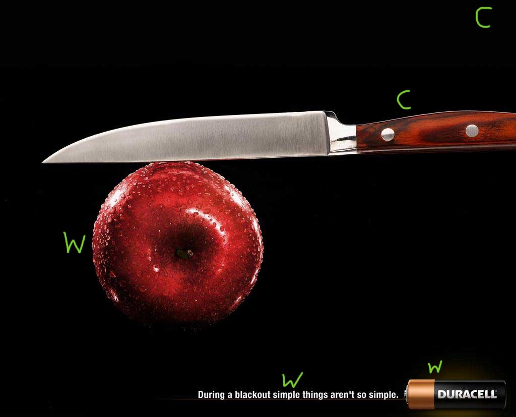
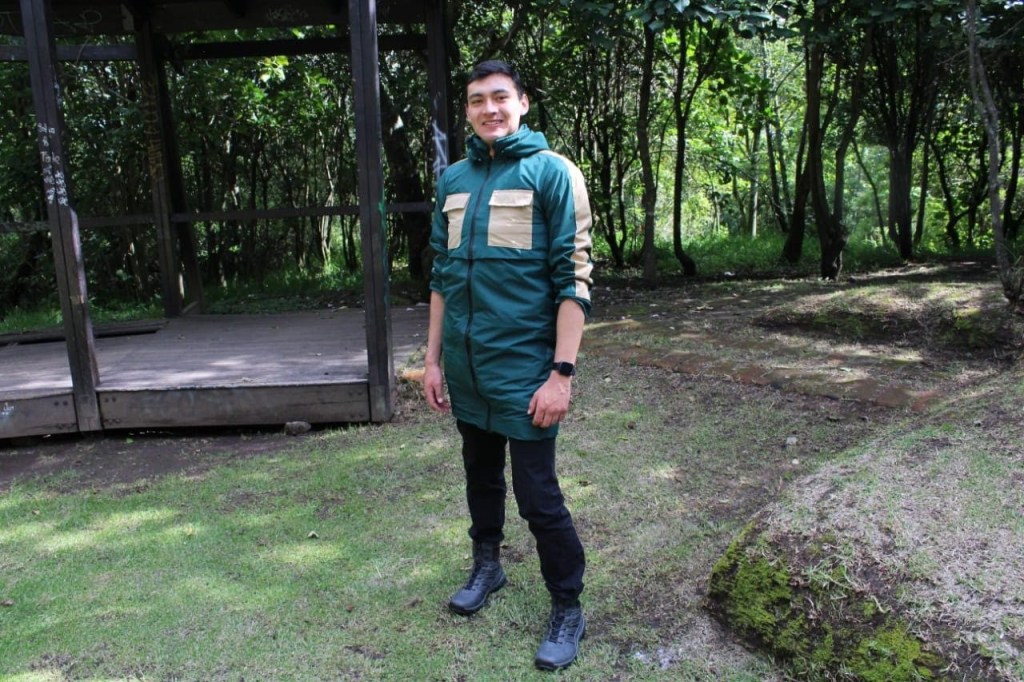
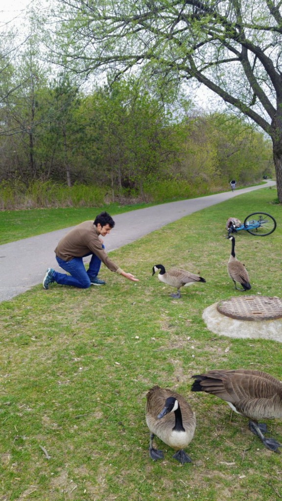
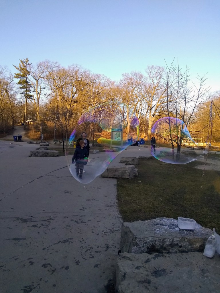
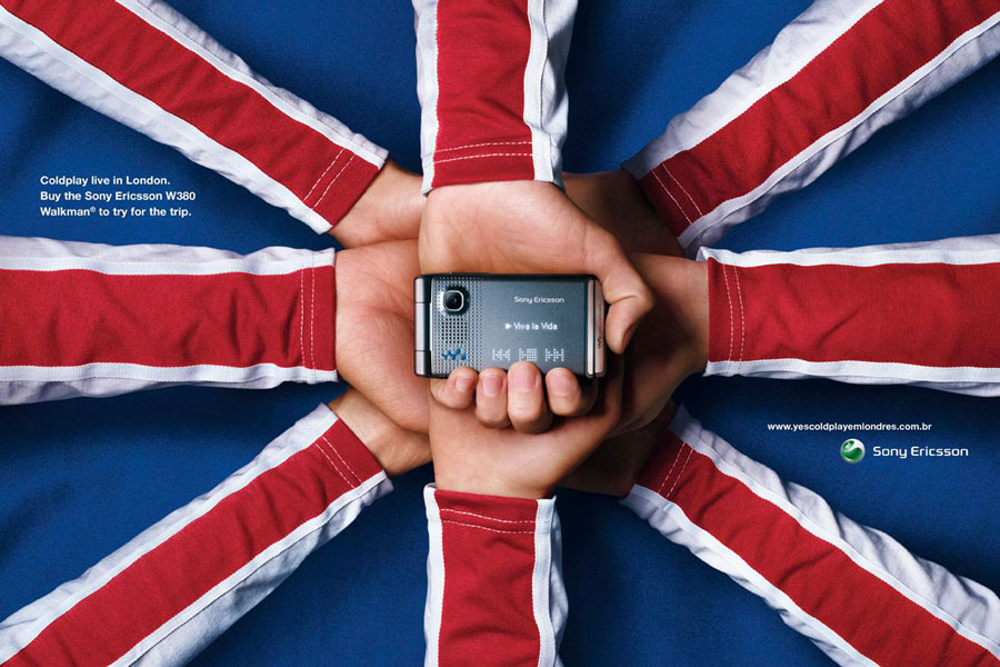
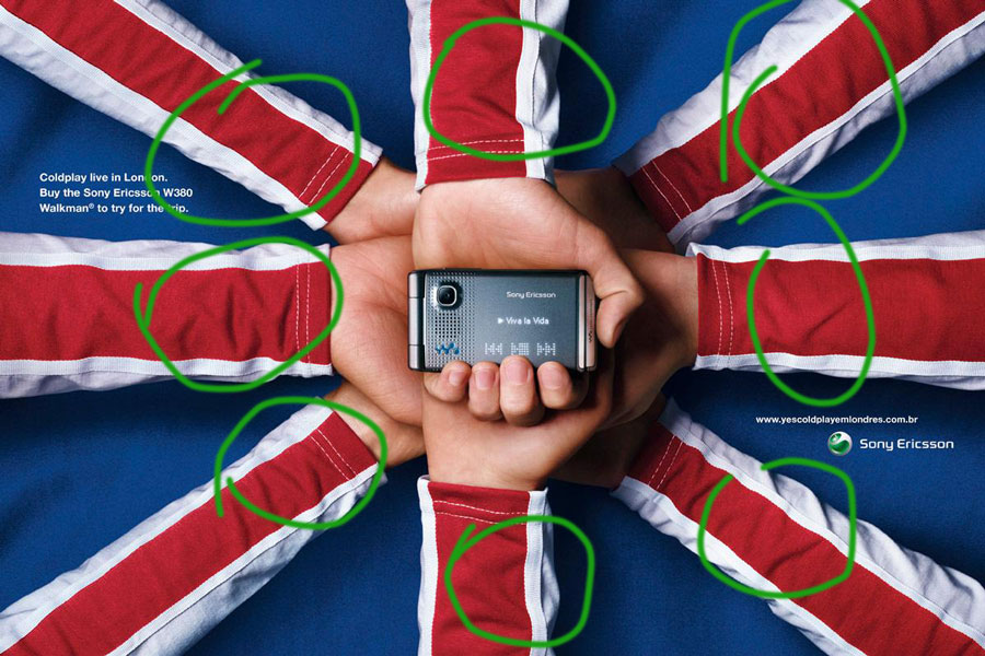
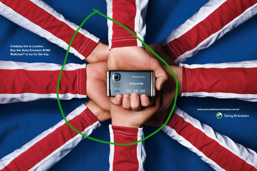
I mimicked the original design because the first photo highlights the lake using the rule of thirds. The second picture uses a natural leading line on the sky and the leading line of the bridge to set the main goal or attraction in the picture. The last one is a good example of the depth of the field since you have a catching background and the elements in the front highlighting the depth of the picture.