Reference: https://www.pinterest.com/pin/450711875177646759/
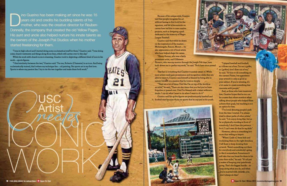
The design was found in a section where many magazine layouts are posted. I didn’t find the author, but you can read in the light blue chart that the article talks about Dino Guarino, an artist. I found the pictures, typefaces, and colors very attractive. The old parchment paper background and the brushes are a good combination in the design.
The article talks about the artist and his attributes. It also shows part of his artwork and style.
TYPEFACE
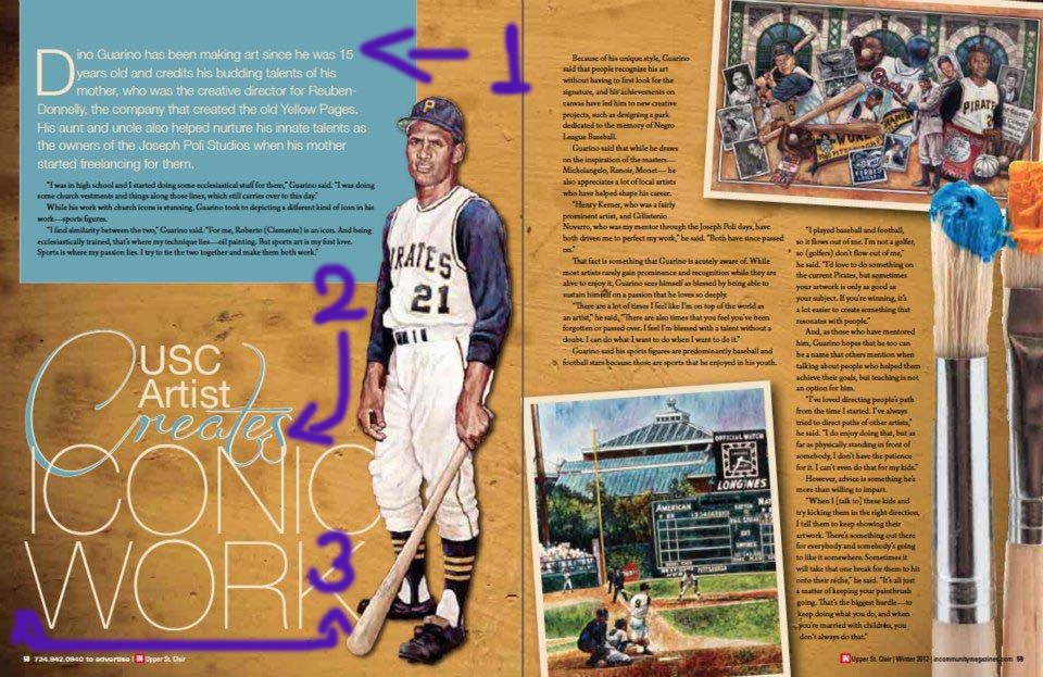
The combination of typefaces is very impressive. The author dared to use four styles. The first section shows Serif (white) and Sans serif (black). The second section uses a Script style with a combination of the old style. The third section uses modern style.
The combination shows contrast and equilibrium. It delights the reader.
PHOTOGRAPHY
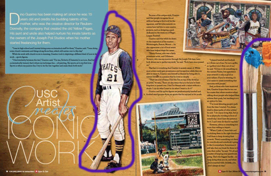
Depth of Field, there are two objects without a frame, the baseball player and the brushes. The brushes seem to be closer than the player to the reader. That is a clever way to use the Depth of Field, to highlight the purpose of the article, or the topic. If it wasn’t like it is, you may think the article is about baseball.
Lead line, This resource may not be as strong as in other magazine layouts, however, the line of the field carries your attention to the player located in the intersection of both tracks. You can find that in the picture located at the left bottom of the second page. The main object of the picture is located is found thanks to the lead lines.
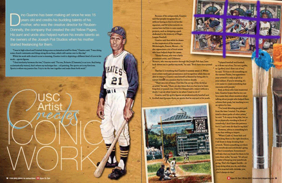
Rule of thirds, There is a player that outstands from the picture located at the right top of the magazine layout. You can easily locate him with the use of the rule of thirds. I like how it was used in this article. The player comes to the main spot of focus.
MIMIC PICTURES OF MY OWN
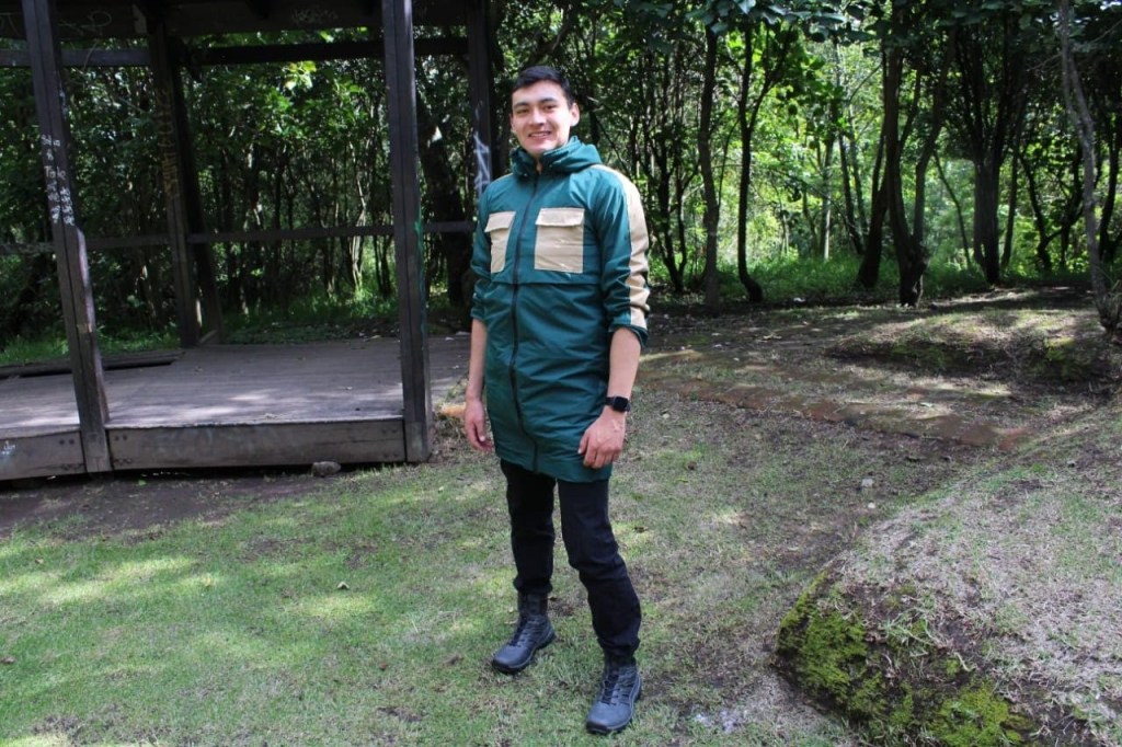
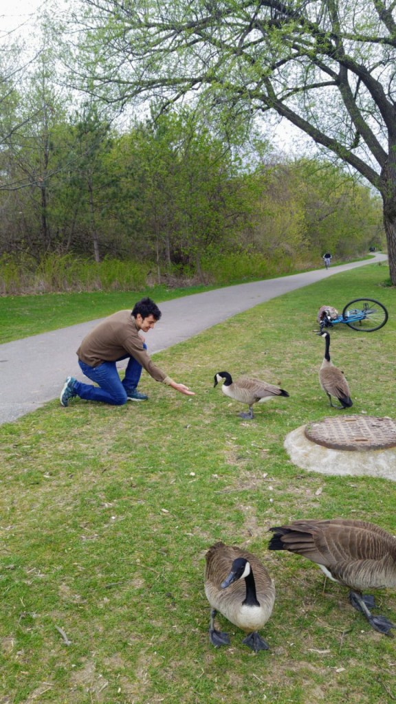

The topic of the magazine is art, maybe the pictures are not drawn, but imagine they are, and the style is not baseball, but parks. You can find that the experiences that you may enjoy in a park are represented and highlighted with the three techniques.
The first one uses the Depth of Field to highlight the person in the picture from his background.
The second picture brings the attention from the track to the man petting the ducks.
On the third pictures you can draw the lines in you head and find that the bubble and the kids are located in the intersection of two of those lines.
This pictures could easily fit in the magazine layout and catch the attention of the reader

