Volkswagen promoted its advanced parking system for the new car models with an original and even fun ad brought by Chief Creative Officer Eric Schoeffler. He developed the design with his team at DDB Tribal Berlin. I will help you discover the main design principles inside the details of this creative ad.
You can fin this and other interesting ads on the following link.
https://www.canva.com/learn/clever-advertising/
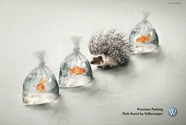
CONTRAST IS WHERE YOU START
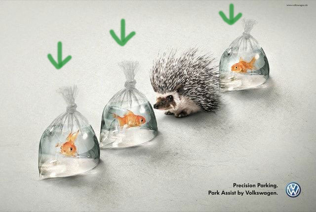
The first detail that catches your attention is how odd it is to find a porcupine, with its spikes so close to the fragile bags with fish. It is undoubtedly a good example of how contrast can catch your attention and, in fact, it adds hierarchy when it highlights the porcupine as the main element. I would even dare to say that he is the main actor (Assuming that it is a plot).
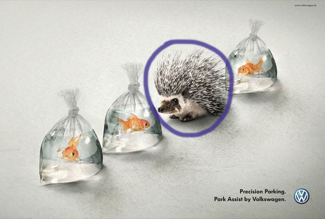
IN THE ALIGNMENT FIND REFINEMENT.
Alignment plays a key role in this campaign. The disposition of the elements in the same line enhances the message Volkswagen attempts to share. Despite it is not usual, you can recall the position of the elements on the page as a parking lot on a street, and all the elements inside the symbolic lines form a whole. The alignment and the phrase “Precision Parking” help you catch the message, even when you don’t show any car.
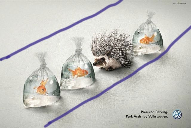
PROXIMITY GOES BEYOND REVELRY.
It is inevitable to check up how close is the porcupine to the plastic bags. The impression that brings to your mind is how well placed it is in the fragile line where he is placed. If all the other elements gave a background to the plot, this is the problem and the solution at the same time. The porcupine proximity to its neighbors highlights how well it is parked.
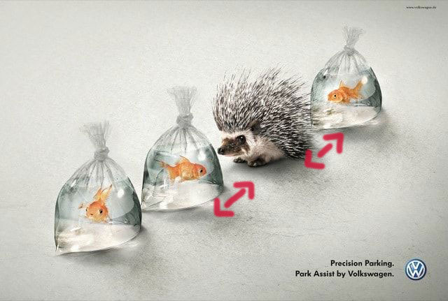
REPETITION IN THE LOT MAKES THE VOLKSWAGEN COME TO THE FRONT.
The only elements that are repeated in the design are the plastic bags. They help you unify the elements and resemble the parking lot. It is complementary to the alignment and proximity principles. The element that is different is the one that represents Volkswagen.
COLOR
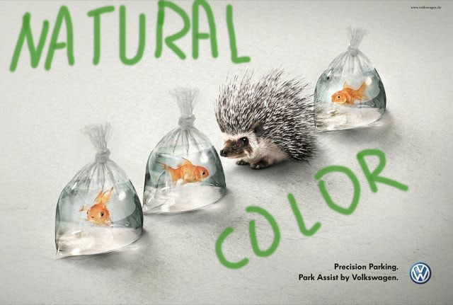
The colors used in this design are pretty simple and natural. They chose a light background and the darkness of the porcupine is part of the contrast.
The combination of colors is not extraordinary at all, but it is natural and simple with some shades, that way you don’t put to much symbolism. If you overwhelm the tacit message, it will be hard to understand. Colors in this design contribute to the other resources. It is different to other designs where the other principles contribute to the message that colors give to you, as it happens with most Coca-Cola designs.
In sum, all the principles described above plus the little label at the bottom create a clever and impressive advertisement, and I love it.

