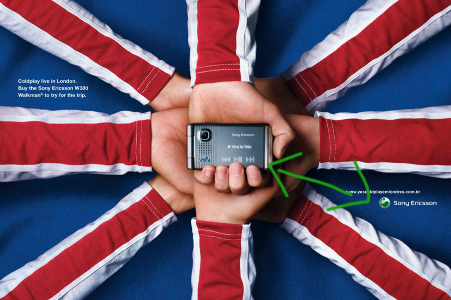
The design set by Sony Ericson in October 2008 is a great example of an efficient application of good design principles.
The picture was taken from: asoftheworld.com/media/print/sony_ericson_coldplay
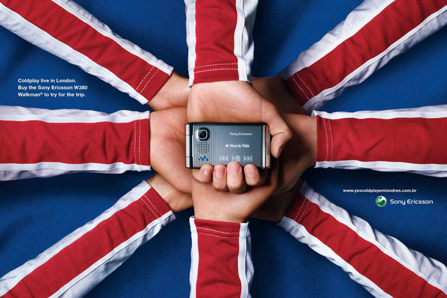
The purpose of the adverstiment by Sony Ericsson was to promote its new W380 Walkman with a Coldplay concert in London.
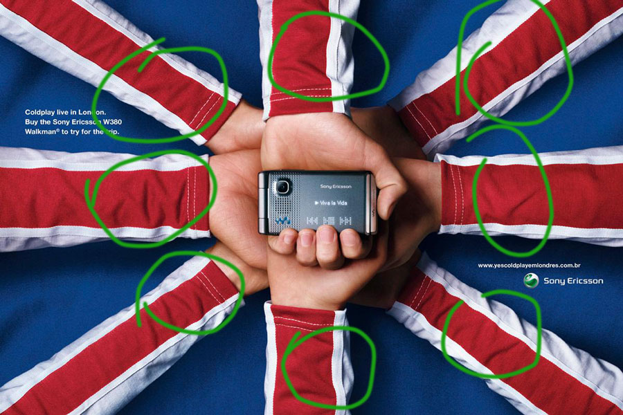
Repetition
Its most distinguishing feature is repetition since its base design is the England Flag. The arms holding the phone create a unique pattern that brings a well-known symbol to the audience. It also catches the public attention since the hands, which represent people to meet on the phone, the main element.
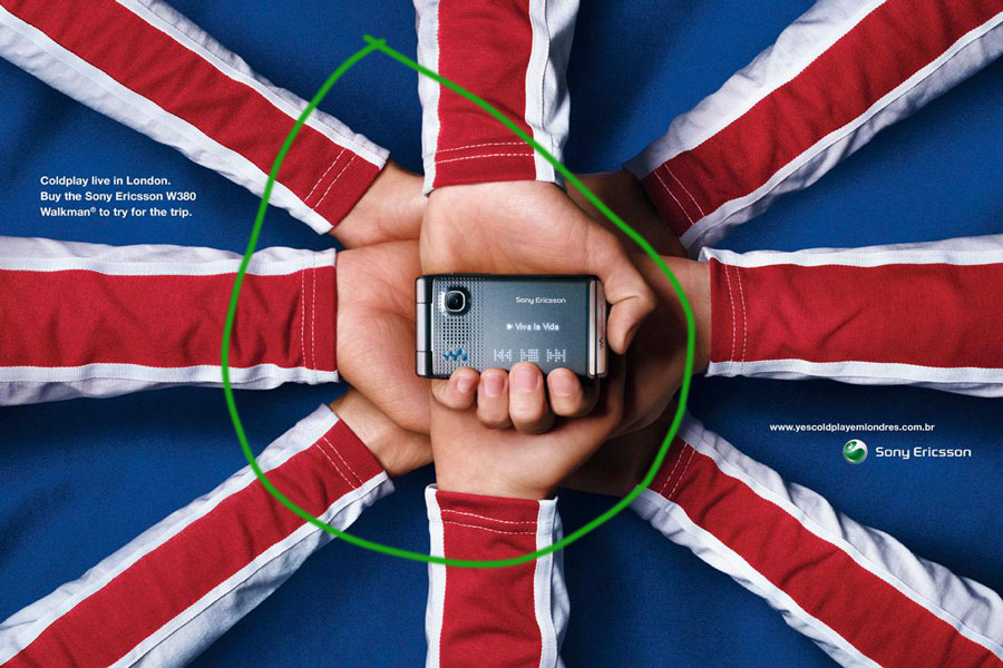
Alignment
The second remarkable feature is the alignment. The arms are simmetrically placed and the main object is in the center of the picture. The order and the convergence of the elements highlight the telephone and the words on the screen.
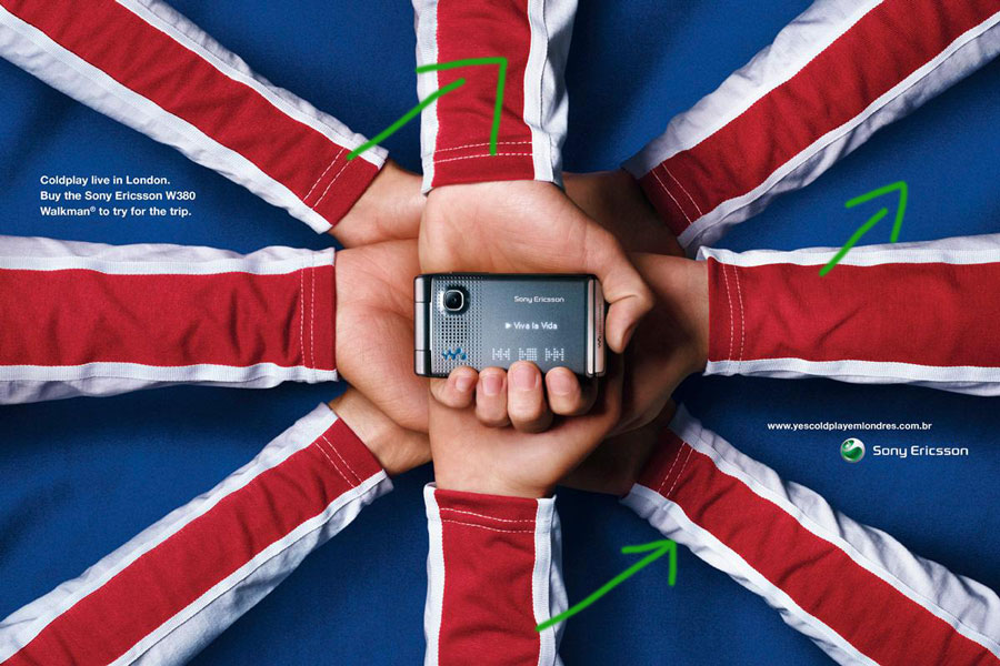
Color
The colors are simple and the picture uses only primarly colors such as, blue as the background and white and red as the sleeves. The phone and hands colors are not as important as the others. The colors make an impact on the obsever’s eyes.
Proximity
The closeness of the walkman and the trademark highlight the importance of the product. The proximity of the screen and the concert information draws the attention to the relationship between the product and the event. It is a usefull resource.
Contrast
The shadows and colors make a contrast between the background and the phone. It heightenens the importance of the product. The difference in the color of the phone and the other elements make it special too.
Based on the analysis I can tell that the features I learned in the COMM 130 course play a crucial role in making an impact.

